Android 4.4 KitKat
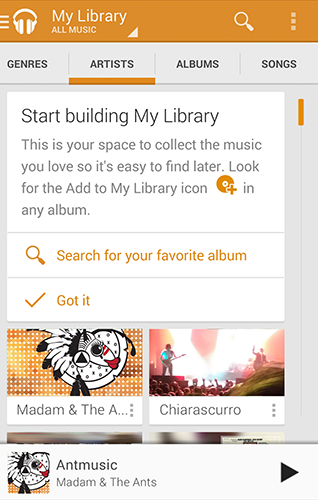
Your branding
Consistency has its place in Android, but you also have the flexibility to
customize the look of your app to reinforce your brand.
Use your brand color for accent by overriding the Android framework's default
blue in UI elements like checkboxes, progress bars, radio buttons, sliders,
tabs, and scroll indicators.
Show your app's launcher icon and name in the action bar so that users can
see it in every screen of your app.
Your Branding highlights
these and other pointers on how to incorporate elements of your brand into your
app's visual language — highly encouraged!
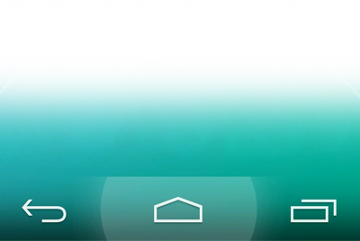
Touch feedback
Before Android KitKat, Android's default touch feedback color was a vibrant
blue. Every touch resulted in a jolt of high-contrast color, in a shade that
might not have mixed well with your brand's color(s).
In Android KitKat and beyond, touch feedback is subtle: when something is
touched, by default its background color slightly darkens or lightens. This
provides two benefits: (1)
sprinkles
of encouragement are more pleasant than jolts, and (2) incorporating your
branding is much easier because the default touch feedback works with
whatever hue you choose. Check the updated
Touch Feedback page for more
details.
Full screen
Android KitKat has improved support for letting your app use the entire
screen, with a few different approaches to meet the varying needs of apps and
content. The new
Full
Screen page will guide you in setting the stage for deep user engagement.
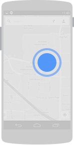
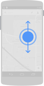
Gestures
The updated
Gestures
page covers new and updated gestures introduced in Android KitKat:
double touch drag and
double touch. These
gestures are used for changing the viewing size of content.
Courtesy: Developer.android.com